Sophia Cigerova
Kategoria
Presentation website
Klient
Sophia Cígerová
Realizácia
1 week
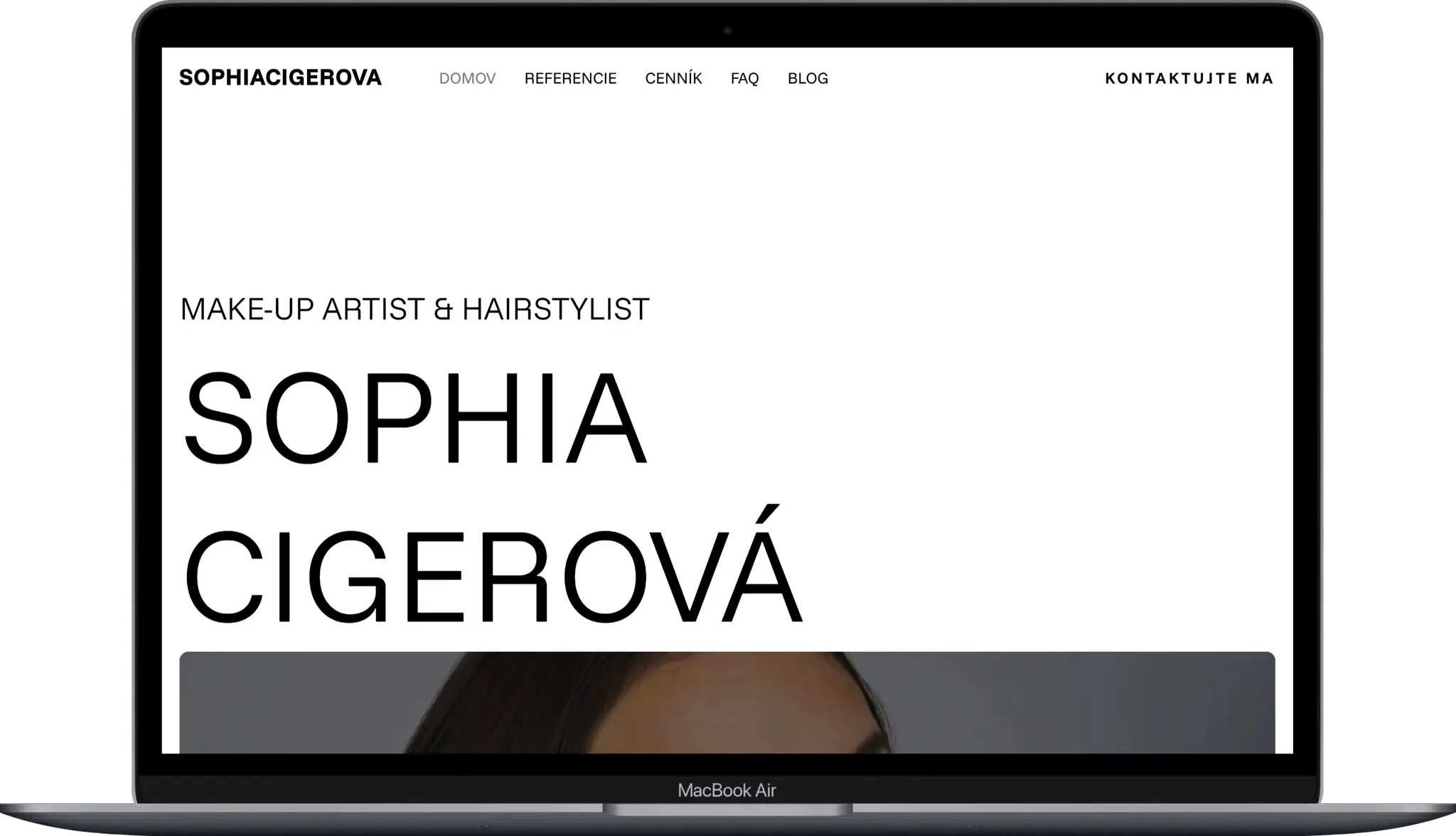
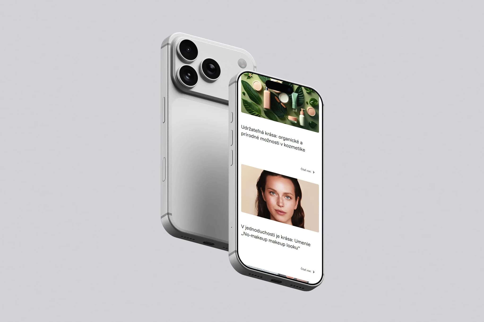
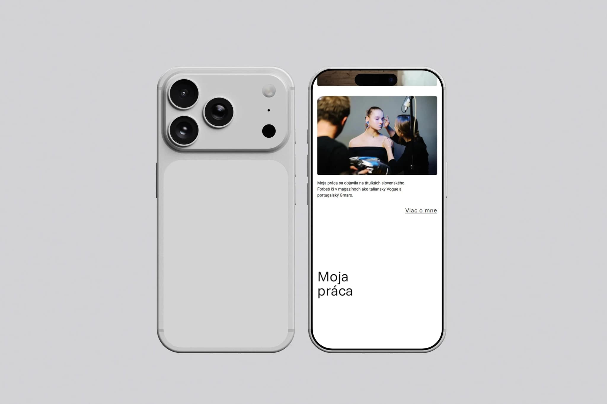
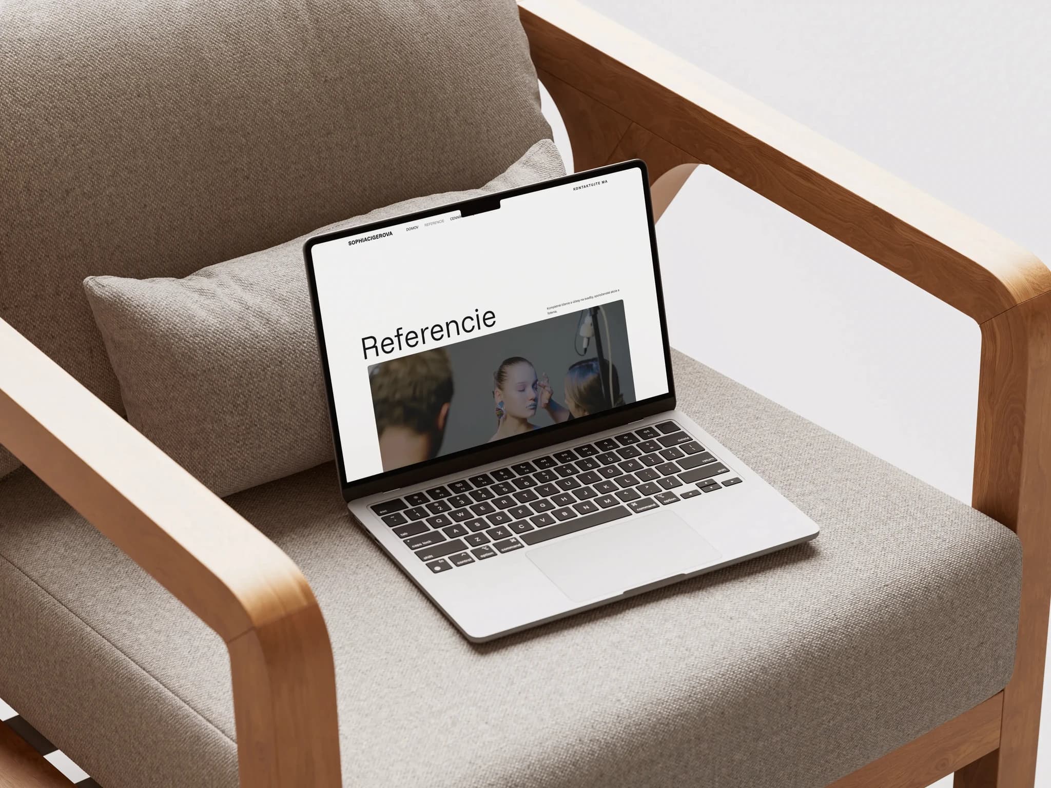
The website for Sophia Cigerova was designed as a clean, confident portfolio that maximizes space for her work. No unnecessary explanations, no distractions. The design is grounded in strong typography, large headings, and a well-organized grid that allows projects to shine and naturally guides the visitor’s attention exactly where it needs to go. The result is a custom presentation website that functions both as a professional business card and a tool for acquiring new clients.
(VÍZIA)
The goal was to create a website that exudes confidence, professionalism, and timelessness. Not a trendy design for one season, but a long-term tool for showcasing work, references, and the client's unique style. A website that will be as relevant a year from now as it is today, because it is based on content quality rather than visual gimmicks.
(PROBLÉM)
Classic portfolio websites often suffer from either information overload or, conversely, sterility, where the visitor has no reason to stay. The challenge was to create a page that does not come off as a generic template or a design experiment at the expense of usability. The solution was to focus on the content itself. The client’s work speaks for itself, and the website's role is merely to frame it appropriately.
(NÁŠ POSTUP)
We chose a minimalist approach, where fewer elements mean greater emphasis. Every design decision has a clear reason: typography as the main visual carrier, grid as a stable foundation, and a thoughtful rhythm throughout the page that supports both readability and aesthetics. We did not optimize for everyone but for the right audience. The site is built to engage those whom Sophia cares about, while not overwhelming others with unnecessary content.
(POTREBY UŽÍVATEĽA)
A potential client wants to quickly grasp the style, quality, and scope of the work. This website enables them to do so in a matter of seconds. Without reading long texts, without distractions, and without unnecessary clicks. A clear structure, strong visual impact, and immediate access to projects. Exactly what someone looking for a creative professional needs to see to decide to reach out.
(VÝZVY)
The biggest challenge was to find a balance between visual expressiveness and functional simplicity. Large typography and a minimalist layout naturally increase the risk of a disconnected impression. Every pixel had to have a clear justification, and every white space needed to work in favor of the overall impression of the page, not against it.
(USER CENTRIC)
The visitor is directed straight to the essentials: the work. Navigation is intuitive, without unnecessary detours and without extra steps. Each project has enough space to stand out on its own, without the need for lengthy descriptions. The entire site is designed so that users spend time viewing the portfolio, not searching for where the portfolio actually is.